Tuesday, 11 September 2012

Life Drawing

Towards the beginning of the year we did several different life drawing sessions.  The first was a new style of life drawing to me; the model walked around the room, and our aim was to try and depict every point and position as a whole on the paper.  This was confusing at first but we linked it to works such as Nude Descending a Staircase by Marcel Duchamp (below).

 
Below is my outcome from the exercise, and a close up of the detail. 


The second life drawing task was similar to what I'd done before at a Royal Academy workshop, where the model stayed in a fixed position.  We looked at some drawings by Alberto Giacometti for inspiration (I can't find them now though!)  The idea was to draw the outlines of the different planes of the body which, on the last week, helped us to paint the planes. 


Wednesday, 5 September 2012

Cathedral Drawing

One of my drawing tasks at University was to draw at Canterbury Cathedral, from observation, in pencil, using only lines.  I took this literally and used mainly straight, vertical lines.  Unlike a lot of other students I didn't focus on the whole cathedral but honed in on the pillars, though I changed the pillars I was looking at several times.

Monday, 14 May 2012

Personal Study: Portraits

Personal Study

Over the last year I have been, as well as doing other things, working on a personal project, where I could choose to look at a subject of my choice in any medium. I chose to work in 2D and look at portraits.  I decided I wanted to use the idea of portraits more as a way in to creating some more abstract work. This allowed me to focus more on the compositions and colour combinations of my work.

Artists who inspired this project:

Frank Auerbach:

 Like I wanted to do, Auerbach's work is evidently based on portraits yet it is also clearly abstract.  He famously paints and then scrapes off the paint and works on top of the ghostly image that it leaves.  He overly works into his drawings, as you can tell by the patched up paper on the left. I like this idea of continueing to work into a piece, as I thought it would help me to focus on the compositions and colour combinations of my work.  Auerbach has a great consideration of the balance of light and dark in his work, as well as the texture.

Leon Kossoff:

For similar reasons to Auerbach (above)


Paul Gauguin & Henri Matisse:

Both of these artists have a fantastic use of colour, jutting bright complememtary colours against eachother to enhance their work.


Like all the others, Creffield's work also has a good use of compostion and contrast in light and dark.  What particularly inspired me about his work is how he removed some of the facial features.  This really helped me to abstract my portraits, allowing me to focus more on the composition and the relationships of colour and texture within my work.


A Sample of My Work for this Project:

I hope you can see both the influence of all these artists and my own intentions.  Enjoy!


Silk Screen Printing

Recently I took a module of 5 afternoons learning how to screen print in a similar style to Andy Warhol.  The image I used was in relation to my Appropriation and Reinterpretation project.  We learnt how to do the block colours and the photo image.  For the photo image you have to:
1. Degrease a silkscreen
2. Coat the silkscreen in 'photocure emulsion'
3. Produce a black and white photocopy of the image you wish to use
4. Spray the image with WD-40
5. Place the image on the silkscreen in a light exposure box.  The box will create a negative version of the image on the silkscreen.
6. Wash the screen to reveal the image
7. Print it the same as you would print with a normal stencil.

Here is an image of one of my finished prints:

Wednesday, 2 May 2012

IMM 4: Painting

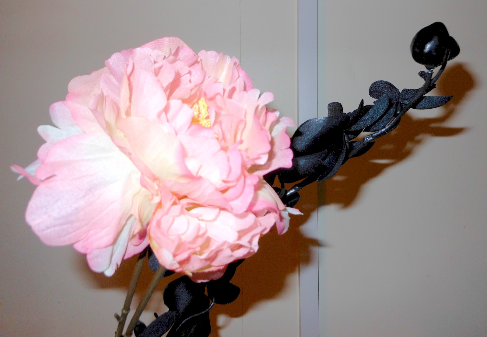
In my latest painting project I decided I wanted to paint still lifes, and was inspired by the paintings of Chinese artist Yun Shouping from the Qing dynasty.  I particularly like the vibrant colours of his work and his compositions, ie how the flowers seem to come in from the side at an angle.

I was also inspired by the close up compositions of Georgia O'Keeffe.  She has also taken great consideration of the angles and colour compositions she uses.

Below are my own photographs and paintings of flowers, inspired by these two artists.  I have tried to focus on the colour combinations and compositions of the paintings, as this is something that both the above artists do and something I am really interested in at the moment.


Sunday, 11 March 2012

IMM: Appropriation & Reinterpretation

My latest project for my Ideas, Meanings and Materials module at CCCU is entitled 'Appropriation & Reinterpretation'.  This basically means taking someone else's ideas and making them your own, or changing the context of something in another way.

I began by looking at Andy Warhol's Campbell's Soup, and then found an appropriation of this by 'Banksy' but using a Tesco Value soup can.

I wanted to continue the appropriation by using other brands, and by scrunching up wrappers.  Here is one of my paintings of a scrunched soup wrapper, along with some etchings of the same thing.

 In painting I combined my appropriation of soup cans with the composition of Wayne Thiebaud's Three Strawberry Shakes, also taking inspiration from some of his colour choices.
Here is the oil painting that I produced:

In printing I was also inspired by some etchings by Morandi; I really liked his use of cross hatching to get different tones.  I appropriated this and produced this sketch and etching:


I then layered up this etching over some images of tin cans (including that of Warhol's Campbell Soup) using a Chine Colle technique.


Finally I combined all my efforts in order to produce this: