Monday, 14 May 2012

Silk Screen Printing

Recently I took a module of 5 afternoons learning how to screen print in a similar style to Andy Warhol.  The image I used was in relation to my Appropriation and Reinterpretation project.  We learnt how to do the block colours and the photo image.  For the photo image you have to:
1. Degrease a silkscreen
2. Coat the silkscreen in 'photocure emulsion'
3. Produce a black and white photocopy of the image you wish to use
4. Spray the image with WD-40
5. Place the image on the silkscreen in a light exposure box.  The box will create a negative version of the image on the silkscreen.
6. Wash the screen to reveal the image
7. Print it the same as you would print with a normal stencil.

Here is an image of one of my finished prints:

Wednesday, 2 May 2012

IMM 4: Painting

In my latest painting project I decided I wanted to paint still lifes, and was inspired by the paintings of Chinese artist Yun Shouping from the Qing dynasty.  I particularly like the vibrant colours of his work and his compositions, ie how the flowers seem to come in from the side at an angle.

I was also inspired by the close up compositions of Georgia O'Keeffe.  She has also taken great consideration of the angles and colour compositions she uses.

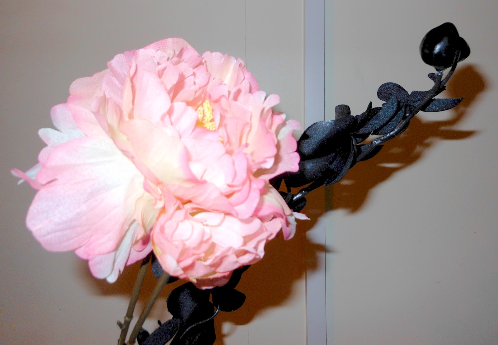
Below are my own photographs and paintings of flowers, inspired by these two artists.  I have tried to focus on the colour combinations and compositions of the paintings, as this is something that both the above artists do and something I am really interested in at the moment.


Sunday, 11 March 2012

IMM: Appropriation & Reinterpretation

My latest project for my Ideas, Meanings and Materials module at CCCU is entitled 'Appropriation & Reinterpretation'.  This basically means taking someone else's ideas and making them your own, or changing the context of something in another way.

I began by looking at Andy Warhol's Campbell's Soup, and then found an appropriation of this by 'Banksy' but using a Tesco Value soup can.

I wanted to continue the appropriation by using other brands, and by scrunching up wrappers.  Here is one of my paintings of a scrunched soup wrapper, along with some etchings of the same thing.

 In painting I combined my appropriation of soup cans with the composition of Wayne Thiebaud's Three Strawberry Shakes, also taking inspiration from some of his colour choices.
Here is the oil painting that I produced:

In printing I was also inspired by some etchings by Morandi; I really liked his use of cross hatching to get different tones.  I appropriated this and produced this sketch and etching:


I then layered up this etching over some images of tin cans (including that of Warhol's Campbell Soup) using a Chine Colle technique.


Finally I combined all my efforts in order to produce this:


Tuesday, 3 January 2012

Science & Art

The second project for my Ideas, Meanings and Materials module at university was titled 'Science & Art'.  We could pick anything science related to base this project on.  I chose to look at intestines, as I found many interesting images of them that I thought would translate well in both my 2D and 3D work.  Here are some of the images I collected through my research (sorry if anyone is squeamish!)


The top pictures are from a real human body.  I obtained these by watching a documentary called 'Anatomy for Beginners', which was on Channel 4 and is still on 4od.  http://www.channel4.com/programmes/anatomy-for-beginners  The other images are ex rays.  In a way I prefer these images, as it is not immidiately evident what they are, so I think I appreciate their beauty a lot more.  I also like the contrast between the colours in the coloured one and between light and dark in the other two.


In sculpture and ceramics I focused on the shapes of the intestines, the idea that they are intertwinning tubes.  To represent this in sculpture I sewed tubes out of different fabrics and stuffed them with stuffing before weaving them together.  My idea to use fabric came from the work of Barry Flanagan, a sculptor who uses canvas stuffed with sand in his work.  I thought this was a really unique approach to sculpture.  http://www.telegraph.co.uk/culture/culturepicturegalleries/8818655/Barry-Flanagan-Early-works-1965-1982.html


I made my ceramic pieces using extruded forms (if you don't know what that is basically you push clay through a machine and it comes out in tubes etc).  I then intertwined these and experimented with making marks to suggest the vieny nature of intestines. I haven't done a lot of ceramics before so my use of glazes and oxides is mainly experimental.  I have some other pieces where I was just experimenting with mark making and glazes but they are not on here!
My tutor wasn't too impresssed with this bottom piece when I was making it but I am actually really pleased with the effect I got with the glaze this time!

The oil paintings I made were based on the coloured scan from my research images.  I wasn't too interested on my paintings looking like intestines, I was more focused on how they looked visually, especially the contrast between the colours.  I actually enjoy the different interpretations I have heard about my work!  You can't see the colours too well in the top image; the dark areas are a lot more blue/bright purple, and the yellow is stronger like in the other painting.


I'm slightly obsessed with printing so I have done a lot of prints.  I did some etchings based on the x-rays I found of intestines.  Again, these were not based on the idea of intestines, more inspired by the beauty of the images themselves.  For this I used aquatint as I thought it'd be the best way to get the simple design and variety of tonal areas I was after.  I then went on to print the etching in a variety of colours, including contrasting colours such as purple and yellow and blue and orange, similar to the colour choices of my paintings.

I then moved onto lino print, and did so many that I don't actually gauge half my hand out if I try really hard!  I came across some prints by Peter Randall-Page that were based on walnuts, but were simple, abstract shapes.  These were a starting point for my lino prints, as well as my images of intestines.  He has a great website where you can find lots of his prints and other work http://www.peterrandall-page.com/about/prints.html.  So my prints started out quite simple and, naturally, I did them in lots of colours.  I then began cutting more areas away and layering up the images to get more intricate outcomes.  The colours, again, link back to my paintings through the use of contrast.


Any comments please feel free!

Wednesday, 21 December 2011

Observation & Analysis Clay Head

One of my university modules is called Observation & Analysis, where we learn different skills for drawing and making from observation.  A lot of my drawings wouldn't come out properly when I tried to scan them, so that will not be appearing here at any point...

For three weeks we created clay heads.  We had a life model and had to take measurements from her, which was actually really interesting and worked on my observation skills.  Here are some photos:


Wednesday, 26 October 2011

Connections and Continuity

This a sample of my work from our first project at uni.  We had to come up with an idea that was personal to us and make work based on that idea.  I took inspiration from my photos of 'Love Padlocks' taken in Prague, Czech Republic.  Each padlock has been put on by someone to represent an eternal relationship, the key thrown in the Vltava river.  To me this represents my close friendships and brings back memories of an amazing trip with a close group of friends.  I have also worked from photos that I have taken of keys. 
Here are some of the photos:


When drawing the padlocks I noticed that complementary colours were next to eachother, which helps to enhance them and make them appear brighter.  Therefore, when I moved onto use acrylic paint, I looked at the image in a different way, painting coloured shapes rather than actual padlocks, making the piece more an exploration of colour harmonies.


In print I created an etching plate based on key shapes and used various techniques to print with it.  I had never done etching before so was very pleased with my results.  When using colour, I contrasted the blue and orangey yellow to enhance the shapes, continueing this exploration of colour harmonies.


My work continues into sculpture, where I constructed some padlocks from chickenwire and modrock. I continued this idea of contrasting colours, using the paint in layers to try and get a rusty effect.


This also translated into plaster pieces, made by pressing locks and keys into clay and filling it with plaster.  I decided to keep this the original colour so as not to complicate it.


In ceramics my work became more abstract as I began to make box structures based on key shapes.  This is currently unfinished as I  haven't decided what sort of glaze to put on it yet.  I have also made paper sculptures like this, and these fit together to represent this idea of locks.


I have actually been developing some of these pieces further and made some more bits but I have left them at uni, so they will have to be added at another time!